Basic processing for 10X Chromium Single Cell 3’ V3 with VoyagerPy#
Introduction#
For areal spatial data, the spatial neighborhood graph is used to indicate proximity, and is required for all spatial analysis methods in the pysal package suite. One of the methods to find the spatial neighborhood graph is \(k\) nearest neighbors, which is also commonly used in gene expression PCA space for graph-based clustering of cells in non-spatial scRNA-seq data. Then, what if we use the \(k\) nearest neighbors graph in PCA space rather than histological space for “spatial”
analyses for non-spatial scRNA-seq data?
Here, were try such an analysis on a human peripheral blood mononuclear cells (PBMC) scRNA-seq dataset, which doesn’t originally have histological spatial organization.
Note: This notebook has an accompanying vignette in R, so we try to match the results as well as we can.
Note: Before running this notebook, make sure you have Scanpy, igraph, and leidenalg installed. These packages can be installed via pip install "scanpy[leiden]".
We begin by importing the following packages.
[1]:
# Install gget
!pip install -q --upgrade gget

import voyagerpy as vp
import numpy as np
import pandas as pd
import matplotlib
from matplotlib import pyplot as plt
import pathlib
import scanpy as sc

import gget

plt.rcParams['figure.dpi'] = 120

# Turn on matplotlib interactive mode so we don't need to explicitly call plt.show()
_ = plt.ion()
Here, we download the filtered Cell Ranger gene count matrix from the 10X website. The empty droplets have already been removed.
[2]:
import requests

# Define the root directory and create it if necessary
root_dir = pathlib.Path('data/nonspatial')

root_dir.mkdir(parents=True, exist_ok=True)
outs_dir = root_dir / 'filtered_feature_bc_matrix'

# Download the gene count matrix
tar_path = root_dir / '5kpbmc.tar.gz'
url_reads = "https://cf.10xgenomics.com/samples/cell-exp/3.0.2/5k_pbmc_v3_nextgem/5k_pbmc_v3_nextgem_filtered_feature_bc_matrix.tar.gz"
if not (outs_dir.exists() or tar_path.exists()):
    res = requests.get(url_reads)
    with tar_path.open('wb') as f:
        f.write(res.content)

# Decompress the downloaded files
if not outs_dir.exists():
    assert tar_path.exists(), f"File {tar_path} does not exist!"
    !tar -xvf $tar_path -C $root_dir
filtered_feature_bc_matrix/
filtered_feature_bc_matrix/matrix.mtx.gz
filtered_feature_bc_matrix/features.tsv.gz
filtered_feature_bc_matrix/barcodes.tsv.gz
We now use VoyagerPy to read the data and create an AnnData object. We use raw=False since we downloaded the filtered gene count matrix.
[3]:
adata = vp.read_10x_counts(root_dir, raw=False, datatype="mtx")
Quality control (QC)#
Here we perform some basic QC, to remove low quality cells with high proportion of mitochondrially encoded counts.
[4]:
is_mt = adata.var['symbol'].str.contains('^mt-', case=False).values
vp.utils.add_per_cell_qcmetrics(adata, subsets={'mito': is_mt})
adata.obs.head()
[4]:
| sum | detected | subsets_mito_sum | subsets_mito_detected | subsets_mito_percent | |
|---|---|---|---|---|---|
| AAACCCAAGACAGCTG-1 | 8385.0 | 2551 | 767.0 | 12 | 9.147287 |
| AAACCCAAGTTAACGA-1 | 11768.0 | 3017 | 741.0 | 12 | 6.296737 |
| AAACCCACAGTCGCAC-1 | 6948.0 | 2034 | 387.0 | 11 | 5.569948 |
| AAACCCAGTAGCTTGT-1 | 9354.0 | 2193 | 725.0 | 12 | 7.750695 |
| AAACCCATCTGCCCTA-1 | 8973.0 | 2632 | 698.0 | 12 | 7.778892 |
The function vp.utils.add_per_cell_qcmetrics computes the total UMI counts detected per cell (the sum column in adata.obs), the number of genes detected per cell (the detected column). Further, since we passed in subsets = {'mito': is_mt}, it computes the sum and detected column on the subset where is_mt is True, as well as the percentage of mitochondrial counts in a cell.
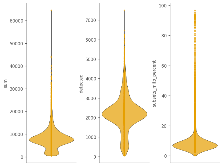
We can make a violin plot for these features.
[5]:
qc_features = ["sum", "detected", "subsets_mito_percent"]

_ = vp.plt.plot_barcode_data(
    adata,
    y=qc_features,
    ncol=3,
)
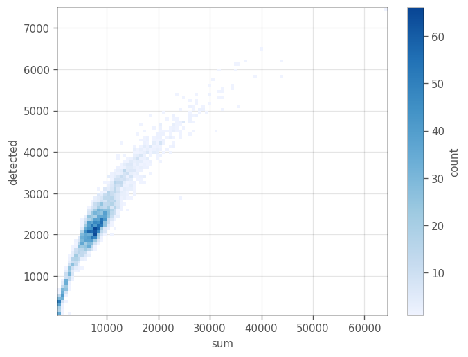
[6]:
_ = vp.plt.plot_barcodes_bin2d(adata, x='sum', y='detected', cmin=1)
[7]:
_ = vp.plt.plot_barcodes_bin2d(adata, x='sum', y='subsets_mito_percent', cmin=1)
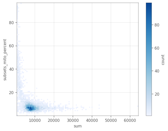
Remove cells with \(\geq 20%\) mitochondrial counts. After we remove these cells, we remove all the genes with zero expression.
[8]:
cells_to_keep = adata.obs["subsets_mito_percent"] < 20

_, genes_to_keep = np.where(adata[cells_to_keep, :].X.sum(axis=0) > 0)
adata = adata[cells_to_keep, genes_to_keep].copy()
adata
[8]:
AnnData object with n_obs × n_vars = 4629 × 21932
    obs: 'sum', 'detected', 'subsets_mito_sum', 'subsets_mito_detected', 'subsets_mito_percent'
    var: 'symbol', 'feature_types'
    uns: 'config'
Basic non-spatial analysis#
Here we normalize the data, perform PCA, cluster the cells, and find marker genes for the clusters. In case we want to access the the original counts and the log-normalized counts later, we store these values in layers of of the AnnData object.
[9]:
adata.X = adata.X.astype('float64')
adata.layers['counts'] = adata.X.copy()

# target_sum = adata.X.sum(axis=1).mean()
# sc.pp.normalize_total(adata, target_sum=target_sum)
# sc.pp.log1p(adata, base=2)

# or, equivalently:
vp.utils.log_norm_counts(adata, inplace=True)

adata.layers['logcounts'] = adata.X.copy()
We use the highly variable genes for PCA.
[10]:
gene_var = vp.utils.model_gene_var(adata.layers['logcounts'], gene_names=adata.var_names)
hvgs = vp.utils.get_top_hvgs(gene_var)
adata.var['highly_variable'] = False
adata.var.loc[hvgs, 'highly_variable'] = True
We can plot the variance explained by each principal component using the elbow_plot in the plotting module of VoyagerPy. We can then determine how many PC’s we use for further analyses.
[11]:
adata.X = vp.utils.scale(adata.X, center=True)
sc.tl.pca(adata, use_highly_variable=True, n_comps=30, random_state=1337)
adata.X = adata.layers['logcounts'].copy()
_ = vp.plt.elbow_plot(adata)
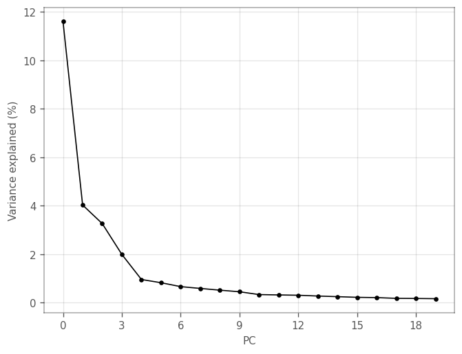
Explained variance drops after the first and fourth components. We can plot the loadings of the genes with the largest (absolute) loadings of the top four PCs.
[12]:
_ = vp.plt.plot_dim_loadings(adata, components=4)
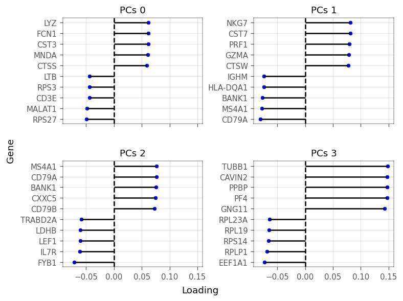
To keep a little more information, we use the top 10 PCs, after which the explained variance levels off even more. We now cluster the cells by the first 10 PCs using Scanpy:
[13]:
sc.pp.neighbors(
    adata,
    n_pcs=10,
    use_rep='X_pca',
    knn=True,
    n_neighbors=11,
)
sc.tl.leiden(
    adata,
    random_state=29,
    resolution=0.2,
    key_added='cluster',
)
/home/docs/checkouts/readthedocs.org/user_builds/voyagerpy/envs/latest/lib/python3.8/site-packages/umap/distances.py:1063: NumbaDeprecationWarning: The 'nopython' keyword argument was not supplied to the 'numba.jit' decorator. The implicit default value for this argument is currently False, but it will be changed to True in Numba 0.59.0. See https://numba.readthedocs.io/en/stable/reference/deprecation.html#deprecation-of-object-mode-fall-back-behaviour-when-using-jit for details.
  @numba.jit()
/home/docs/checkouts/readthedocs.org/user_builds/voyagerpy/envs/latest/lib/python3.8/site-packages/umap/distances.py:1071: NumbaDeprecationWarning: The 'nopython' keyword argument was not supplied to the 'numba.jit' decorator. The implicit default value for this argument is currently False, but it will be changed to True in Numba 0.59.0. See https://numba.readthedocs.io/en/stable/reference/deprecation.html#deprecation-of-object-mode-fall-back-behaviour-when-using-jit for details.
  @numba.jit()
/home/docs/checkouts/readthedocs.org/user_builds/voyagerpy/envs/latest/lib/python3.8/site-packages/umap/distances.py:1086: NumbaDeprecationWarning: The 'nopython' keyword argument was not supplied to the 'numba.jit' decorator. The implicit default value for this argument is currently False, but it will be changed to True in Numba 0.59.0. See https://numba.readthedocs.io/en/stable/reference/deprecation.html#deprecation-of-object-mode-fall-back-behaviour-when-using-jit for details.
  @numba.jit()
/home/docs/checkouts/readthedocs.org/user_builds/voyagerpy/envs/latest/lib/python3.8/site-packages/umap/umap_.py:660: NumbaDeprecationWarning: The 'nopython' keyword argument was not supplied to the 'numba.jit' decorator. The implicit default value for this argument is currently False, but it will be changed to True in Numba 0.59.0. See https://numba.readthedocs.io/en/stable/reference/deprecation.html#deprecation-of-object-mode-fall-back-behaviour-when-using-jit for details.
  @numba.jit()
Next, we plot the cells in the space of the first four PCs. The diagonals are density plots of the number of cells as projected on each PC. The cells are colored by the clusters found using leiden’s clustering above.
[14]:
ax = vp.plt.plot_pca(adata, ndim=4, figsize=(7,7), color_by='cluster', cmap='tab10')
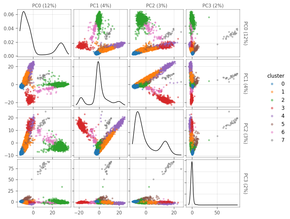
How many cells are there in each cluster?
[15]:
adata.obs.groupby('cluster')['cluster'].count()
[15]:
cluster
0    1393
1    1049
2     962
3     590
4     405
5     110
6      93
7      27
Name: cluster, dtype: int64
Next, we can use Mann-Whitney-Wilcoxon tests to find marker genes for each cluster. The test compares each cluster to the rest of the cells. Only genes that get higher scores in the cluster, compared to the other cells, are considered.
[16]:
markers = vp.utils.find_markers(adata)
[17]:
marker_genes = [
    marker.sort_values(by='p.value').iloc[0].name
    for _, marker in sorted(markers.items())
]

marker_genes_symbols = adata.var.loc[marker_genes, "symbol"].tolist()
adata.var.loc[marker_genes, ["symbol"]]
[17]:
| symbol | |
|---|---|
| ENSG00000122406 | RPL5 |
| ENSG00000277734 | TRAC |
| ENSG00000163131 | CTSS |
| ENSG00000105369 | CD79A |
| ENSG00000105374 | NKG7 |
| ENSG00000251562 | MALAT1 |
| ENSG00000196126 | HLA-DRB1 |
| ENSG00000120885 | CLU |
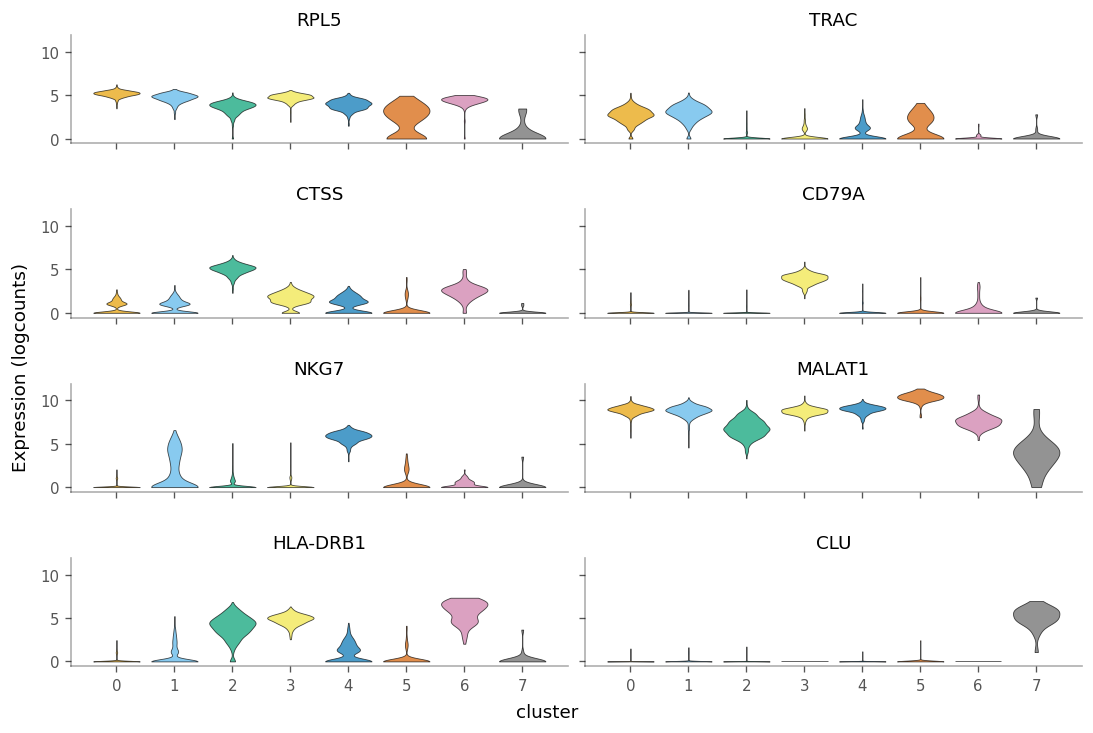
Note that the marker genes acquired here are not the same as the ones found by SCRAN in the companion Voyager vignette. This is mainly due to the difference in the clustering, but also due to different solvers yielding slightly different results.
We can see how specific the marker genes are to each cluster by creating violin plots.
[18]:
_ = vp.plt.plot_expression(
    adata,
    marker_genes,
    groupby='cluster',
    show_symbol=True,
    layer='logcounts',
    figsize=(9, 6),
    scatter_points=False
)
We can use the gget_info module from the gget package to get additional information for these marker genes. For example, their NCBI description:
[19]:
gget_info = gget.info(marker_genes)
gget_info[['ensembl_gene_name', 'ensembl_description']]
Tue Jul 18 17:02:55 2023 WARNING No reviewed UniProt results were found for ID ENSG00000277734. Returning all unreviewed results.
Tue Jul 18 17:03:11 2023 WARNING No UniProt entry was found for ID ENSG00000251562.
[19]:
| ensembl_gene_name | ensembl_description | |
|---|---|---|
| ENSG00000122406 | RPL5 | ribosomal protein L5 [Source:HGNC Symbol;Acc:H... |
| ENSG00000277734 | TRAC | T cell receptor alpha constant [Source:HGNC Sy... |
| ENSG00000163131 | CTSS | cathepsin S [Source:HGNC Symbol;Acc:HGNC:2545] |
| ENSG00000105369 | CD79A | CD79a molecule [Source:HGNC Symbol;Acc:HGNC:1698] |
| ENSG00000105374 | NKG7 | natural killer cell granule protein 7 [Source:... |
| ENSG00000251562 | MALAT1 | metastasis associated lung adenocarcinoma tran... |
| ENSG00000196126 | HLA-DRB1 | major histocompatibility complex, class II, DR... |
| ENSG00000120885 | CLU | clusterin [Source:HGNC Symbol;Acc:HGNC:2095] |
“Spatial” analyses for QC metrics#
Find \(k\) nearest neighbor graph in PCA for Moran’s I.
We use sc.pp.neighbors to compute the KNN. To mimick the accompanying R vignette, we normalize the inverse of the distances with the neighbours of each node. The distance matrix resides in adata.obsp["knn_distances"], whereas the connectivites (binary connectivities) and weights are stored in adata.obsp["knn_connectivities"] and adata.obsp["knn_weights"], respectively. Note, that the names of these graphs are a result of passing key_added="knn" to sc.pp.neighbors.
[20]:
sc.pp.neighbors(
    adata,
    n_neighbors=11,
    n_pcs=10,
    use_rep='X_pca',
    knn=True,
    random_state=29,
    method='gauss', # one of umap, gauss, rapids
    metric='euclidean', # many metrics available,
    key_added='knn'
)

dist = adata.obsp['knn_distances'].copy()
dist.data = 1 / dist.data

# row normalize the matrix, this makes the matrix dense.
dist /= dist.sum(axis=1)

# convert dist back to sparse matrix
from scipy.sparse import csr_matrix
adata.obsp["knn_weights"] = csr_matrix(dist)

del dist

knn_graph = "knn_weights"

# adata.obsp["knn_connectivities"] represent the edges, while adata.opsp["knn_weights"] represent the weights
adata.obsp["knn_connectivities"] = (adata.obsp[knn_graph] > 0).astype(int)
vp.spatial.set_default_graph(adata, knn_graph)
vp.spatial.to_spatial_weights(adata, graph_name=knn_graph)
/home/docs/checkouts/readthedocs.org/user_builds/voyagerpy/envs/latest/lib/python3.8/site-packages/libpysal/cg/alpha_shapes.py:39: NumbaDeprecationWarning: The 'nopython' keyword argument was not supplied to the 'numba.jit' decorator. The implicit default value for this argument is currently False, but it will be changed to True in Numba 0.59.0. See https://numba.readthedocs.io/en/stable/reference/deprecation.html#deprecation-of-object-mode-fall-back-behaviour-when-using-jit for details.
  def nb_dist(x, y):
/home/docs/checkouts/readthedocs.org/user_builds/voyagerpy/envs/latest/lib/python3.8/site-packages/libpysal/cg/alpha_shapes.py:165: NumbaDeprecationWarning: The 'nopython' keyword argument was not supplied to the 'numba.jit' decorator. The implicit default value for this argument is currently False, but it will be changed to True in Numba 0.59.0. See https://numba.readthedocs.io/en/stable/reference/deprecation.html#deprecation-of-object-mode-fall-back-behaviour-when-using-jit for details.
  def get_faces(triangle):
/home/docs/checkouts/readthedocs.org/user_builds/voyagerpy/envs/latest/lib/python3.8/site-packages/libpysal/cg/alpha_shapes.py:199: NumbaDeprecationWarning: The 'nopython' keyword argument was not supplied to the 'numba.jit' decorator. The implicit default value for this argument is currently False, but it will be changed to True in Numba 0.59.0. See https://numba.readthedocs.io/en/stable/reference/deprecation.html#deprecation-of-object-mode-fall-back-behaviour-when-using-jit for details.
  def build_faces(faces, triangles_is, num_triangles, num_faces_single):
/home/docs/checkouts/readthedocs.org/user_builds/voyagerpy/envs/latest/lib/python3.8/site-packages/libpysal/cg/alpha_shapes.py:261: NumbaDeprecationWarning: The 'nopython' keyword argument was not supplied to the 'numba.jit' decorator. The implicit default value for this argument is currently False, but it will be changed to True in Numba 0.59.0. See https://numba.readthedocs.io/en/stable/reference/deprecation.html#deprecation-of-object-mode-fall-back-behaviour-when-using-jit for details.
  def nb_mask_faces(mask, faces):
[20]:
AnnData object with n_obs × n_vars = 4629 × 21932
    obs: 'sum', 'detected', 'subsets_mito_sum', 'subsets_mito_detected', 'subsets_mito_percent', 'cluster'
    var: 'symbol', 'feature_types', 'highly_variable'
    uns: 'config', 'pca', 'neighbors', 'leiden', 'knn', 'spatial'
    obsm: 'X_pca'
    varm: 'PCs'
    layers: 'counts', 'logcounts'
    obsp: 'distances', 'connectivities', 'knn_distances', 'knn_connectivities', 'knn_weights'
Moran’s I#
Compute Moran’s I over the KNN graph.
[21]:
morans = vp.spatial.moran(adata, qc_features, graph_name=knn_graph)
adata.uns['spatial']['moran'][knn_graph].loc[qc_features, ["I"]]
[21]:
| I | |
|---|---|
| sum | 0.654432 |
| detected | 0.749596 |
| subsets_mito_percent | 0.438459 |
For total UMI counts (sum), and genes detected (detected), Moran’s I is quite strong but weaker for the percentage of mitochondrial counts (subsets_mito_percent).
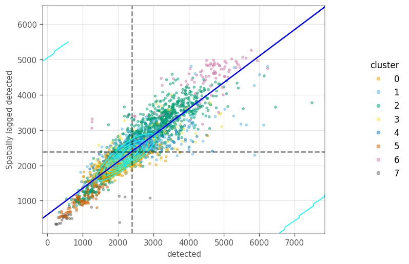
Moran Plot#
How are the local variation on the \(k\) nearest neighbour graph? The Moran plot displays the feature of interest on the \(x\) axis, whereas the \(y\) axis displays the same feature but spatially lagged. A line fitted through these points has a slope equal to the Moran’s I. The dashed lines are the averages for each axis. The cyan contours mark the densities of the points.
These plots sometimes portray clusters different from the neighborhood we computed earlier. We start by computing the spatial lag for the QC metrics, so we don’t have to compute them on the fly in the moran plot.
[22]:
vp.spatial.compute_spatial_lag(
    adata,
    qc_features,
    graph_name=knn_graph,
    inplace=True
)

ax = vp.plt.moran_plot(adata, feature='sum', color_by='cluster', alpha=0.8)
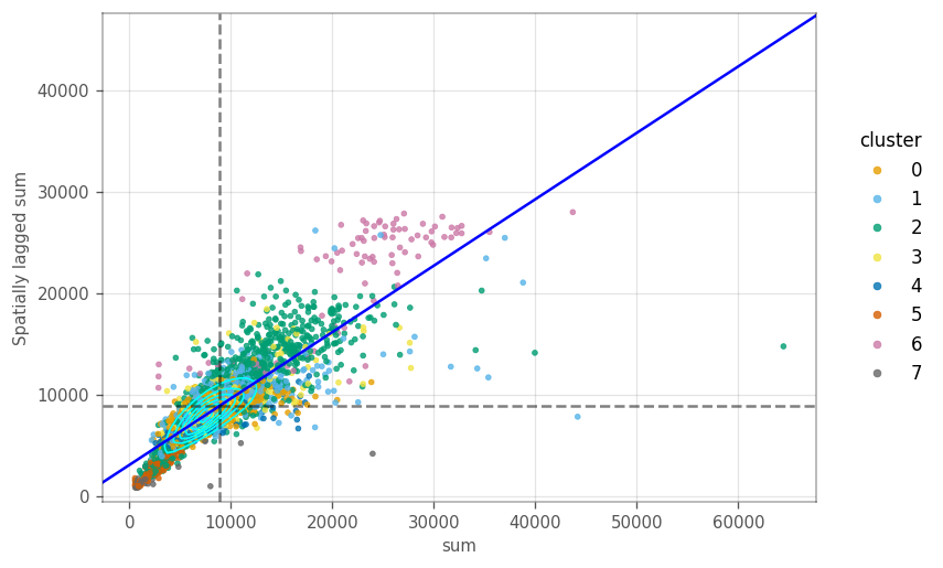
Most cells in the plot cluster around the average. However, there is a cluster of cells with lower total counts, whose neighbours also have lower total counts. Similarly, there are cells with higher total counts, like their neighbors. These clusters seem to be somewhart related to some gene expression based clusters.
[23]:
ax = vp.plt.moran_plot(adata, feature='detected', color_by='cluster', alpha=0.5)
[24]:
ax = vp.plt.moran_plot(
    adata,
    feature='subsets_mito_percent',
    color_by="cluster",
    alpha=0.5,
)
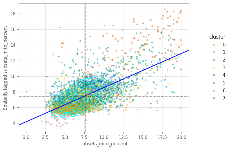
In the last two plots, there is only one main cluster, but cells are somewhat separated by gene expression clusters. This is not too surprising, as there clusters were computed on the same graph as the Moran’s I.
Cells in cluster 5 have higher percentage of mitochondrial counts, as do their neighbors.
Local Moran’s I#
We also want to visualize the local Moran’s I for the three QC metrics.
Let’s compute the locan Moran’s metrics for the features.
[25]:
_ = vp.spatial.local_moran(adata, qc_features, graph_name=knn_graph)
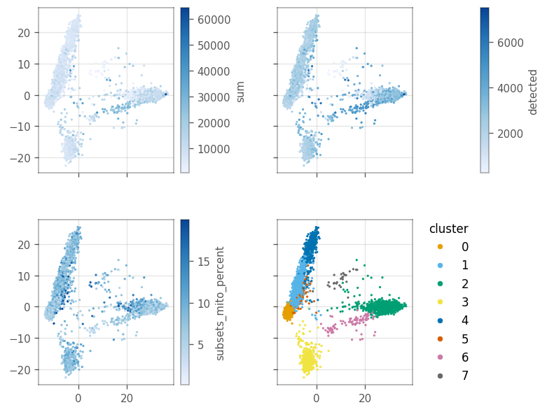
Since we don’t have a histological space, how do we visualize the local “spatial” statistics? PCA can somewhat separate the clusters, as we computed the clusters based on the PCA distances. In this case, we can treat the first two principal components as if they’re the histological space.
Here, we use the first two principal components as our spatial coordinates. Thus, we convert them to gpd.GeoSeries[shapely.Point] and set them as our geometry using the set_geometry function.
[26]:
# Get the x and y values from PCA
pca_0, pca_1 = adata.obsm["X_pca"][:, :2].T

# Convert the vectors to a gpd.GeoSeries of shapely.Point objects
pca_points = vp.spatial.to_points(pca_0, pca_1)

# Set the points as the geometry for the barcodes
_ = vp.spatial.set_geometry(adata, 'pca', pca_points)
Plot the value of the QC features in the first two PCs.
[27]:
axs = vp.plt.plot_spatial_feature(adata, qc_features + ['cluster'], s=2)
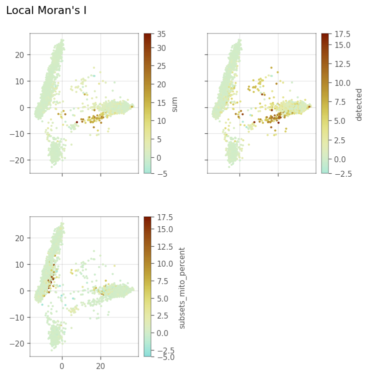
Here, we plot the local Moran’s I metrics.
[28]:
_ = vp.plt.plot_local_result(
    adata,
    obsm="local_moran",
    features=qc_features,
    figsize=(6,6),
    divergent=True,
    s=4,
    figtitle="Local Moran's I",
)
What if there is no good 2D representation for the data? Since the KNN graph was computed over the first 10 PCs so the graph is not restricted to a 2D representation. We can still make histograms to show the distribution and scatter plots to compare the same local metric for different variables.
Here, we make a histogram-like plot of local Moran’s I for the features. The values are binned as in histograms, but we draw a line through the top of the each bar instead of drawing the bars. This helps us visualize the absolute value without any bars getting hidden.
We use log scale on the y-axis. Since some values are zero, we add one to each count before the log-scale is computed.
[29]:
axs = vp.plt.plot_barcode_histogram(
    adata,
    qc_features,
    obsm="local_moran",
    color_by='cluster',
    log=True,
    histtype='line',
    bins=50,
)
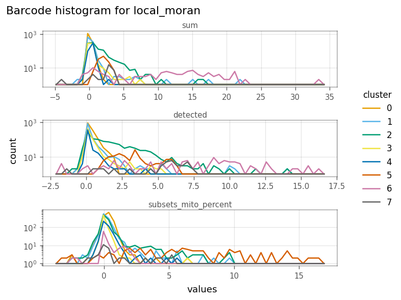
In the figure above, we see that the cells in cluster 6 have very strong local Moran’s I in total UMI counts (sum) and genes detected. This means they tend to be more homogeneous in these QC metrics.
How do local Moran’s I for these metrics relate to each other?
[30]:
ax = vp.plt.plot_barcode_data(
    adata,
    x="sum",
    y="detected",
    obsm="local_moran",
    color_by="cluster",
    cmap='tab10',
)

# set equal aspect to get a nicer figure
ax.flat[0].set_aspect('equal')
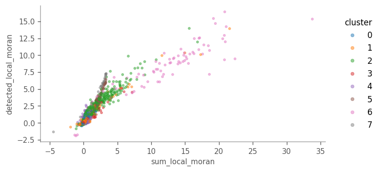
Cells more locally homogeneous in total UMI counts are also more homogeneous in number of genes detected. This is not surprising given the correlation between the
[31]:
ax = vp.plt.plot_barcode_data(
    adata,
    x="sum",
    y="subsets_mito_percent",
    obsm="local_moran",
    color_by="cluster",
    cmap='tab10',
    alpha=0.4,
)
ax.flat[0].set_aspect('equal')
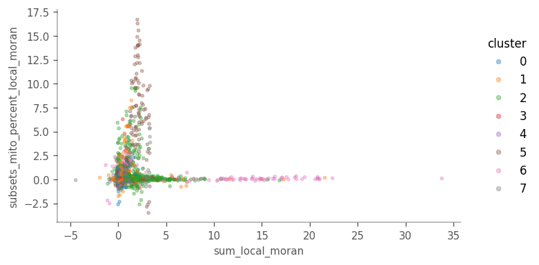
For local Moran’s I, sum vs subsets_mito_percent shows a more interesting pattern, highlighting clusters 5 and 6.
But how does local Moran’s I relate to the feature itself?
To plot this, we must add the sum column from adata.obsm['local_moran'] to adata.obs
[32]:
adata.obs["sum_localmoran"] = adata.obsm["local_moran"]["sum"]
ax = vp.plt.plot_barcode_data(
    adata,
    x="sum",
    y="sum_localmoran",
    color_by="cluster",
    cmap='tab10',
    contour_kwargs=dict(linewidths=1, colors="blue", levels=7),
)
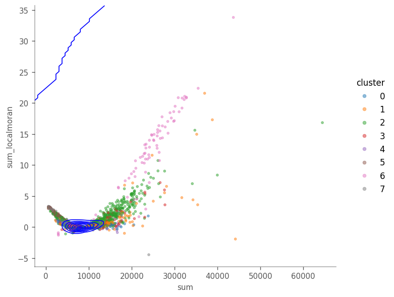
Looking at the figure above we see that in general, cells with highet total counts tend to have higher local Moran’s I, but we also see points with higher local Moran’s I that the total counts. The density contours show that most cells are concentrated around \(y=9000\).
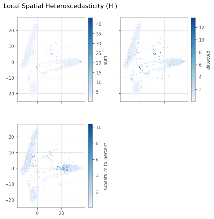
Local Spatial heteroscedasticity (LOSH)#
LOSH indicates heterogeneity around each cell in the KNN graph.
[33]:
_ = vp.spatial.losh(adata, qc_features, graph_name=knn_graph)
[34]:
_ = vp.plt.plot_local_result(
    adata,
    "losh",
    qc_features,
    ncol=2,
    figtitle="Local Spatial Heteroscedasticity (Hi)",
    subplot_kwargs=dict(figsize=(6,6)),
    s=2,
)
Here, we make the same pseudo-spatial plots for LOSH as for local Moran’s I.
[35]:
_ = vp.plt.plot_barcode_histogram(
    adata,
    qc_features,
    obsm="losh",
    color_by='cluster',
    log=True,
    histtype='line',
    bins=50,
    figsize=(7, 6)
)
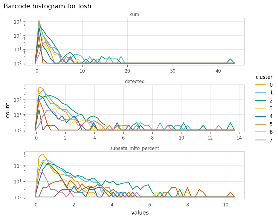
Here, clusters 1 and 2 tend to be more locally heterogeneous in the number of genes detected, and clusters 2 and 5 in mitochondrial counts. How do total counts and genes detected relate in LOSH?
[36]:
ax = vp.plt.plot_barcode_data(
    adata,
    x="sum",
    y="detected",
    obsm='losh',
    color_by="cluster",
    cmap='tab10'
)

ax.flat[0].set_aspect(2/1)
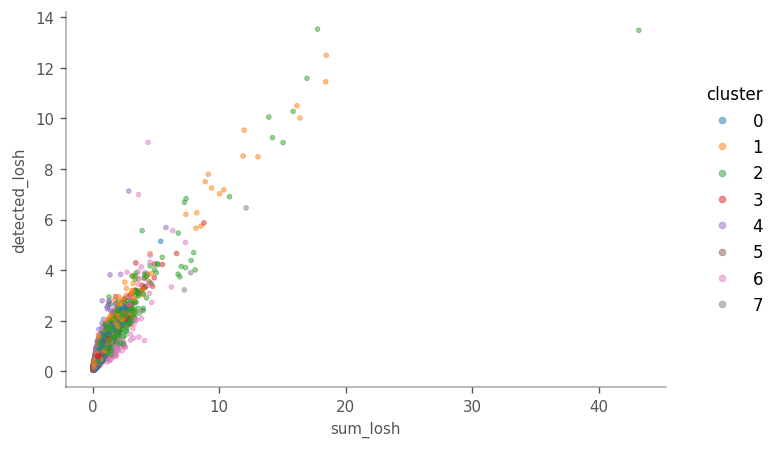
While, in general, cells higher in LOSH in total counts are also higher in LOSH in genes detected, there are some outliers very high in both metrics, with more hererogeneous neighborhoods. Absolutes distance to the neighbors is not taken into account when the adjacency matrix is row-normalized. It would be interesting to see if those outliers tend to be further away fom their 10 nearest neighbors, or in a region in the PCA space where the cells are further apart.
How does total counts itself relate to its LOSH?
[37]:
# Again, we must put the values from adata.obsm["losh"] into the adata.obs dataframe
adata.obs["sum_losh"] = adata.obsm["losh"]["sum"]
_ = vp.plt.plot_barcode_data(
    adata,
    x="sum",
    y="sum_losh",
    color_by="cluster",
    cmap='tab10'
)
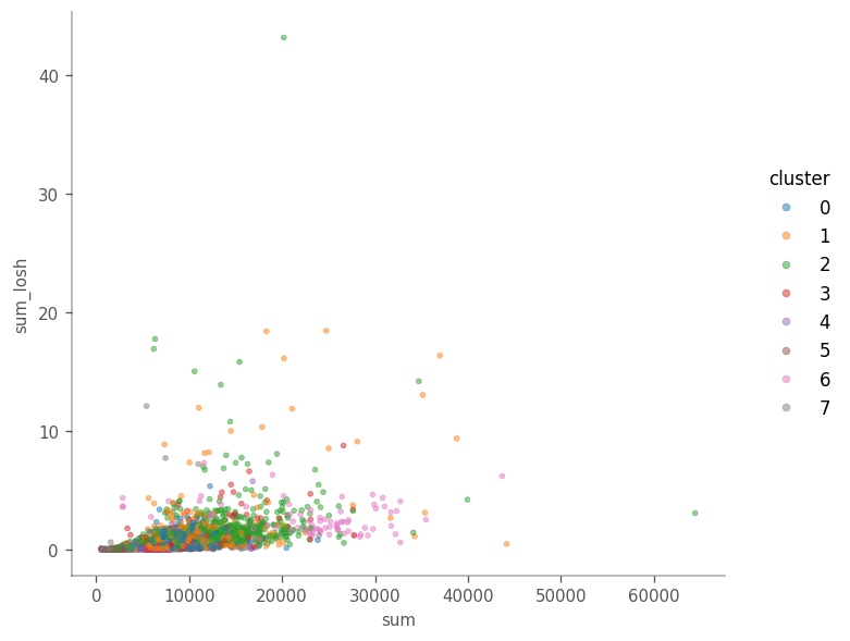
There does not seem to be a clear relationship in this case.
“Spatial” analyses for gene expression#
Here, we join all the marker data frames and only keep the rows where FDR < 0.05.
[38]:
top_markers_df = pd.concat([
    pd.DataFrame({'cluster': str(i_cluster),  **dict(m[m['FDR'] < 0.05])})
    for i_cluster, (key, m) in enumerate(sorted(markers.items()))
])

top_markers_df['symbol'] = adata.var.loc[top_markers_df.index, "symbol"]
Moran’s I#
Here, we compute Moran’s I for the top highly variavle genes. Since Moran’s I is a global metric, it is stored in adata.uns["spatial"]["moran"][graph_name]. We copy these values to adata.var and associate it with the HVGs in order to plot them.
[39]:
# Compute Moran's I for the expression
vp.spatial.moran(adata, feature=hvgs, dim='var', graph_name=knn_graph)
hvgs_moransI = adata.uns['spatial']['moran'][knn_graph].loc[hvgs, 'I']
# Store the results in adata.var
adata.var.loc[hvgs, "moran"] = hvgs_moransI
[40]:
adata.var.loc[hvgs, ["symbol", "moran"]].sort_values(by='moran')
[40]:
| symbol | moran | |
|---|---|---|
| ENSG00000167740 | CYB5D2 | -0.001106 |
| ENSG00000083099 | LYRM2 | 0.001915 |
| ENSG00000177082 | WDR73 | 0.002389 |
| ENSG00000198498 | TMA16 | 0.003682 |
| ENSG00000089818 | NECAP1 | 0.003801 |
| ... | ... | ... |
| ENSG00000163736 | PPBP | 0.961939 |
| ENSG00000090382 | LYZ | 0.964329 |
| ENSG00000163737 | PF4 | 0.967025 |
| ENSG00000168497 | CAVIN2 | 0.967328 |
| ENSG00000101162 | TUBB1 | 0.967396 |
2000 rows × 2 columns
How are the Moran’s I for highly variable genes distributed? Also, where are the top cluster marker genes in this distribution?
The top marker genes are marked by the vertical lines through this barplot.
[41]:
_ = vp.plt.plot_features_histogram(
    adata,
    "moran",
    bins=50,
    log=False,
    histtype="bar",
    markers=marker_genes,
    show_symbol=True
)
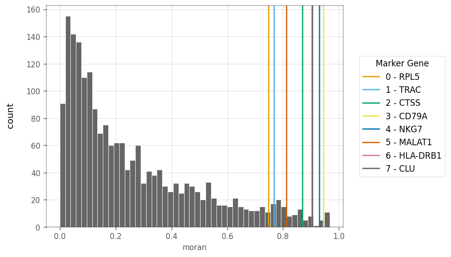
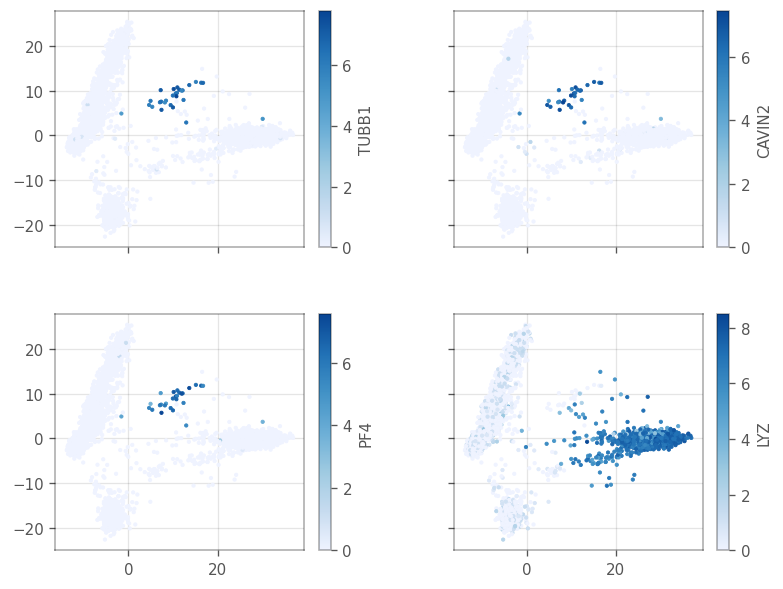
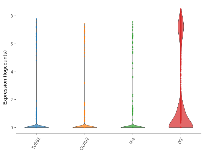
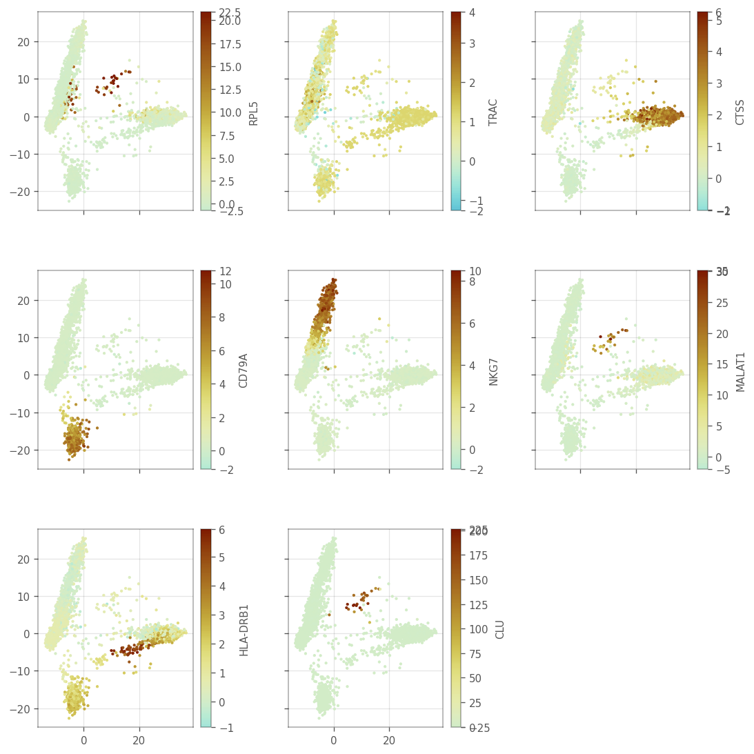
The top marker genes have quite high Moran’s I in the KNN. Since the KNN graph was computed in PCA space of gene expression, Moran’s I is mostly positive, but not always strong. A small number of genes have slightly negative Moran’s I. What do the genes with the strongest Moran’s i look like in PCA?
[42]:
top_moran = adata.var['moran'].sort_values(ascending=False)[:4].index.tolist()

ax = vp.plt.plot_spatial_feature(
    adata,
    top_moran,
    layer='logcounts',
    aspect='equal'
)
[43]:
_ = vp.plt.plot_expression(
    adata,
    top_moran,
    show_symbol=True,
    cmap='tab10',
    layer='logcounts',
)
[44]:
top_markers_df.loc[top_moran]
[44]:
| cluster | p.value | FDR | summary.AUC | symbol | |
|---|---|---|---|---|---|
| ENSG00000101162 | 7 | 4.191297e-26 | 2.298088e-22 | 1.000000 | TUBB1 |
| ENSG00000168497 | 7 | 5.897827e-25 | 1.437235e-21 | 1.000000 | CAVIN2 |
| ENSG00000163737 | 7 | 1.967301e-27 | 1.438228e-23 | 1.000000 | PF4 |
| ENSG00000090382 | 2 | 5.470234e-19 | 1.333035e-15 | 0.997382 | LYZ |
These are all marker genes from cluster 7, except LYZ, which is a marker gene for cluster 2. Maybe they have high Moran’s I because they are specific to a cell type. Then how does the Moran’s I relate to cluster AUC and the p-value from the differential expression?
[45]:
# Check if markers any markers are shared across clusters
any(top_markers_df.index.duplicated())
[45]:
False
[46]:
adata.var['moran'] = adata.var['moran'].astype('double')

top_markers_df['log_p_adj'] = -np.log10(top_markers_df['FDR'])
top_markers_df['cluster'] = top_markers_df['cluster'].astype("category")
top_markers_df['moran'] = adata.var['moran']
How does the differential expressino p-value relate to Moran’s I?
Here, we use VoyagerPy’s scatter function, a handy wrapper around matplotlib’s scatter function.
[47]:
ax = vp.plt.scatter(
    x='log_p_adj',
    y='moran',
    color_by='cluster',
    data=top_markers_df,
    fitline_kwargs=dict(color='blue'),
)
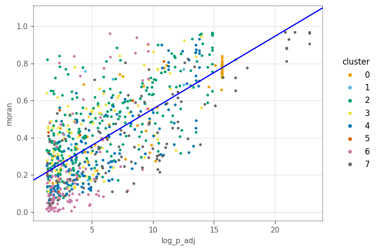
Generally more significant marker genes tend to have higher Moran’s I. This is not surprising since the cluster’s and Moran’s I were computed from the same KNN graph.
[48]:
ax = vp.plt.scatter(
    'summary.AUC',
    'moran',
    color_by='cluster',
    data=top_markers_df,
    fitline_kwargs=dict(color='b'))
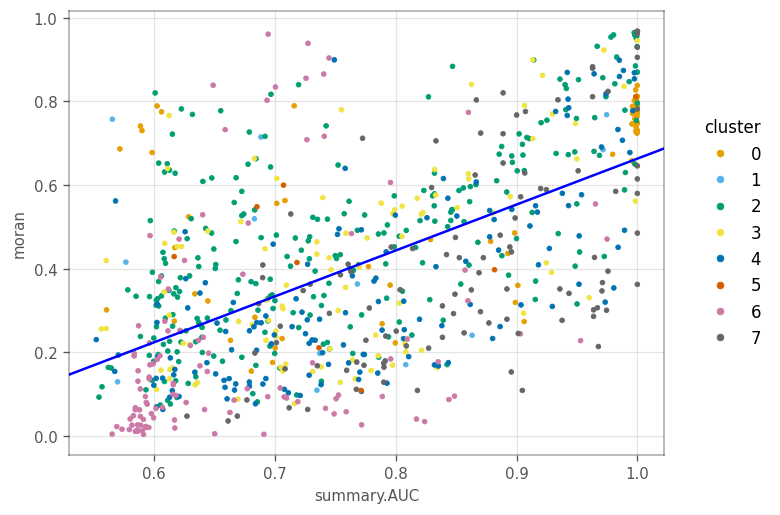
Similarly, genes with higher AUC tend to have higher Moran’s I. For other clusters, generally, genes more specific to a cluster tend to have higher Moran’s I.
We compute Moran’s I again, but with permutation testing to see if the values are statistically significant.
[49]:
vp.spatial.moran(adata, marker_genes, graph_name=knn_graph, dim='var', permutations=200)
_ = vp.plt.plot_moran_mc(adata, marker_genes, graph_name=knn_graph)
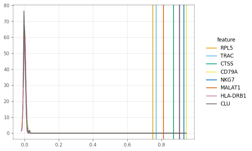
The vertical line show the computed Moran’s I, whereas the other lines show the density of the I’s from the permutations.
The correlogram finds Moran’s I for higher order neighbors and can be a proxy for distance.
[50]:
vp.spatial.compute_higher_order_neighbors(adata, order=6)
vp.spatial.compute_correlogram(adata, marker_genes, order=6)
[50]:
| 1 | 2 | 3 | 4 | 5 | 6 | |
|---|---|---|---|---|---|---|
| ENSG00000122406 | 0.745945 | 0.702658 | 0.636827 | 0.564654 | 0.445039 | 0.379302 |
| ENSG00000277734 | 0.766371 | 0.750481 | 0.735574 | 0.72206 | 0.705661 | 0.683275 |
| ENSG00000163131 | 0.869973 | 0.871116 | 0.869841 | 0.869394 | 0.865482 | 0.854052 |
| ENSG00000105369 | 0.944168 | 0.939252 | 0.942749 | 0.948737 | 0.94834 | 0.935505 |
| ENSG00000105374 | 0.930081 | 0.916024 | 0.892393 | 0.849208 | 0.79007 | 0.718997 |
| ENSG00000251562 | 0.809861 | 0.782392 | 0.745432 | 0.711838 | 0.619922 | 0.551992 |
| ENSG00000196126 | 0.903677 | 0.898423 | 0.889412 | 0.872563 | 0.853404 | 0.834882 |
| ENSG00000120885 | 0.906784 | 0.904006 | 0.854464 | 0.729027 | 0.148032 | 0.006476 |
[51]:
_ = vp.plt.plot_correlogram(adata, features=marker_genes)
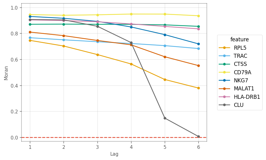
Here, we see different patterns of decay in spatial autocorrelation and different length scales of spatial autocorrelation. CLU is the marker gene for a very small cluster, so higher order neighbors are likely to be from other clusters. Nonetheless, marker genes for other large clusters display different patterns in the correlogram.
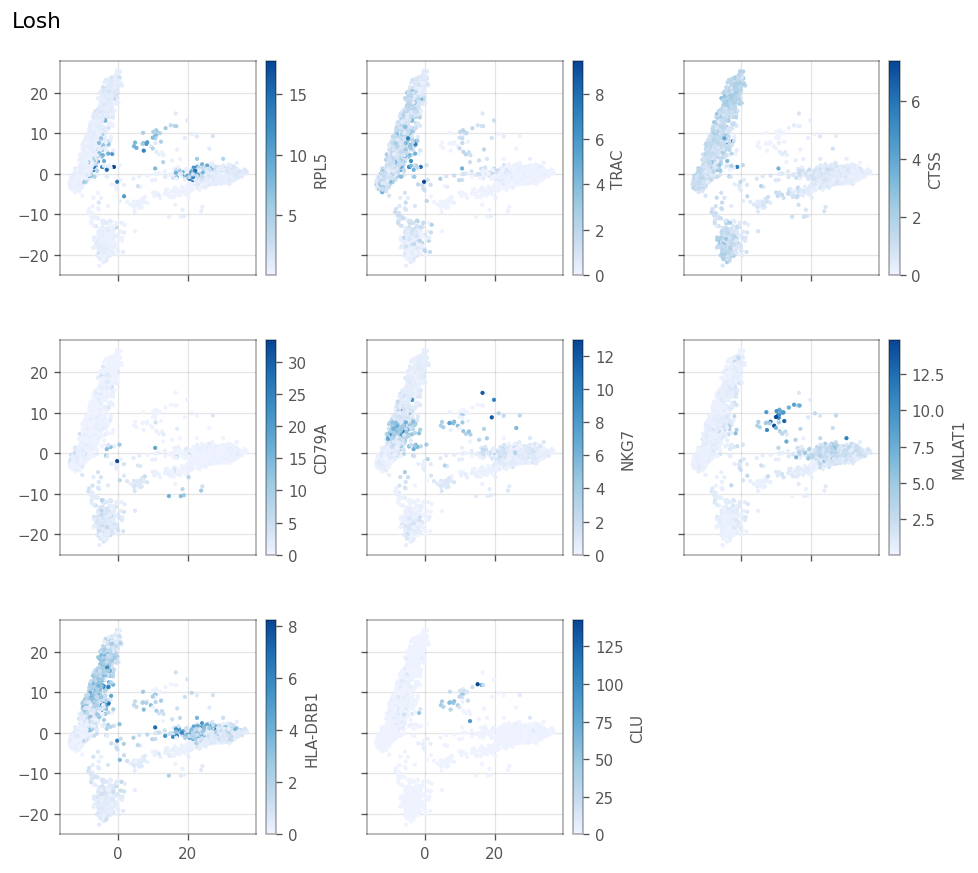
Local Moran’s I#
[52]:
_ = vp.spatial.local_moran(adata, marker_genes, layer='logcounts')
[53]:
_ = vp.plt.plot_spatial_feature(
    adata,
    marker_genes,
    obsm='local_moran',
    divergent=True,
    ncol=3,
    figsize=(9,9)
)
We also plot the histograms
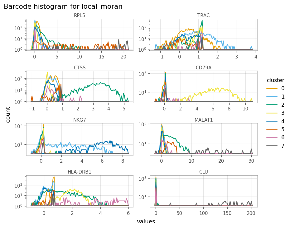
[54]:
_ = vp.plt.plot_barcode_histogram(
    adata,
    marker_genes,
    color_by='cluster',
    obsm='local_moran',
    histtype='line',
    figsize=(7,6),
    subplot_kwargs=dict(layout='constrained'),
    label=marker_genes_symbols,
    ncol=2
)
The scatter plots as shown in the “spatial” analyses for QC metrics section can be made to see how local Moran’s I relates to the expression of the gene itself.
[55]:
axs = vp.plt.plot_expression(
    adata,
    gene=marker_genes[1],
    y=marker_genes[1], # This is the y-axis, and should be a column in adata.obsm['local_moran']
    layer='logcounts',
    obsm='local_moran',
    color_by='cluster',
    alpha=0.5,
    contour_kwargs={'colors': 'blue'}
)
For this gene, there are two wings and a central value where the local Moran’s I is around 0, just like it did for total UMI counts. Generally, cells with higher expressino of this gene have higher local Moran’s I. The contours tell us that many cells do not express this gene, and we can see that their neighbors have low and slightly homogeneous expression of this gene. This pattern may be different for other genes,
LOSH#
[56]:
_ = vp.spatial.losh(
    adata,
    marker_genes,
    graph_name = knn_graph,
    layer='logcounts'
)
[57]:
_ = vp.plt.plot_local_result(
    adata,
    obsm='losh',
    features=marker_genes,
    ncol=3,
    show_symbol=True,
    figsize=(8,7)
)
[58]:
axs = vp.plt.plot_barcode_histogram(
    adata,
    marker_genes,
    color_by='cluster',
    histtype='line',
    obsm='losh',
    ncol=2,
    figsize=(9,6),
    label=[f'Cluster {c} - {gene}' for c, gene in enumerate(marker_genes_symbols)],
    subplot_kwargs=dict(dpi=150)
)
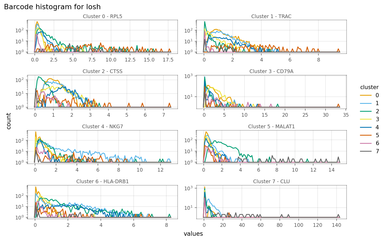
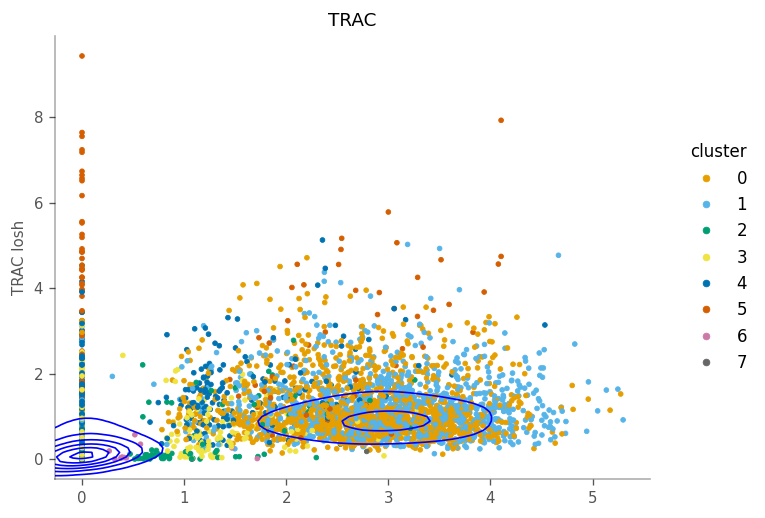
Relationship between expression and LOSH is more complicated. For some genes, such as the marker gene for cluster 1 (TRAC), cells within the cluster, i.e. with higher expression, also have higher LOSH. This is much like how in Poisson and binomial distributions, higher means also means higher variance. However, for some genes, such as CTSS, have lower LOSH among cells that have higher expression, which means expressino of this gene is more homogeneous within the cluster, consistent with
local Moran.
[59]:
_ = vp.plt.plot_expression(
    adata,
    gene=marker_genes[1],
    y=marker_genes[1],
    obsm='losh',
    color_by='cluster',
    contour_kwargs=dict(colors='blue'),
)
For this gene, the density tells us that many cells don’t express it and have homogeneous neighborhoods with low expression. The column of cells with 0 expression means that their neighboring cells have different level of heterogeneity in this gene.
Moran Plot#
Here we make Moran plots for the top marker genes. We begin by computing the spatial lag explicitly.
[60]:
_ = vp.spatial.compute_spatial_lag(
    adata,
    marker_genes,
    graph_name=knn_graph,
    inplace=True,
    layer='logcounts',
)
As a reference, we show the Moran’s I for the top markers. Remember that these are the slopes of the fitted lines through the points.
[61]:
top_markers_df.loc[marker_genes, :]
[61]:
| cluster | p.value | FDR | summary.AUC | symbol | log_p_adj | moran | |
|---|---|---|---|---|---|---|---|
| ENSG00000122406 | 0 | 2.536379e-19 | 2.088259e-16 | 1.000000 | RPL5 | 15.680216 | 0.748286 |
| ENSG00000277734 | 1 | 1.721807e-17 | 2.946574e-13 | 0.974561 | TRAC | 12.530683 | 0.768130 |
| ENSG00000163131 | 2 | 3.606917e-19 | 1.333035e-15 | 1.000000 | CTSS | 14.875158 | 0.869931 |
| ENSG00000105369 | 3 | 7.318198e-19 | 1.036729e-14 | 0.999937 | CD79A | 13.984335 | 0.944850 |
| ENSG00000105374 | 4 | 1.643240e-18 | 1.536775e-14 | 0.999817 | NKG7 | 13.813390 | 0.930633 |
| ENSG00000251562 | 5 | 5.693205e-16 | 1.248634e-11 | 0.998653 | MALAT1 | 10.903565 | 0.811205 |
| ENSG00000196126 | 6 | 1.520607e-14 | 2.366976e-10 | 0.744851 | HLA-DRB1 | 9.625806 | 0.903637 |
| ENSG00000120885 | 7 | 1.966551e-27 | 1.438228e-23 | 1.000000 | CLU | 22.842172 | 0.905245 |
[62]:
axs = vp.plt.moran_plot(
    adata,
    feature=marker_genes,
    color_by='cluster',
    alpha=0.8,
    ncol=3,
    figsize=(9,9),
    subplot_kwargs=dict(
        wspace=0.2,
        hspace=0,
        dpi=100
    ),
    layer='logcounts'
)
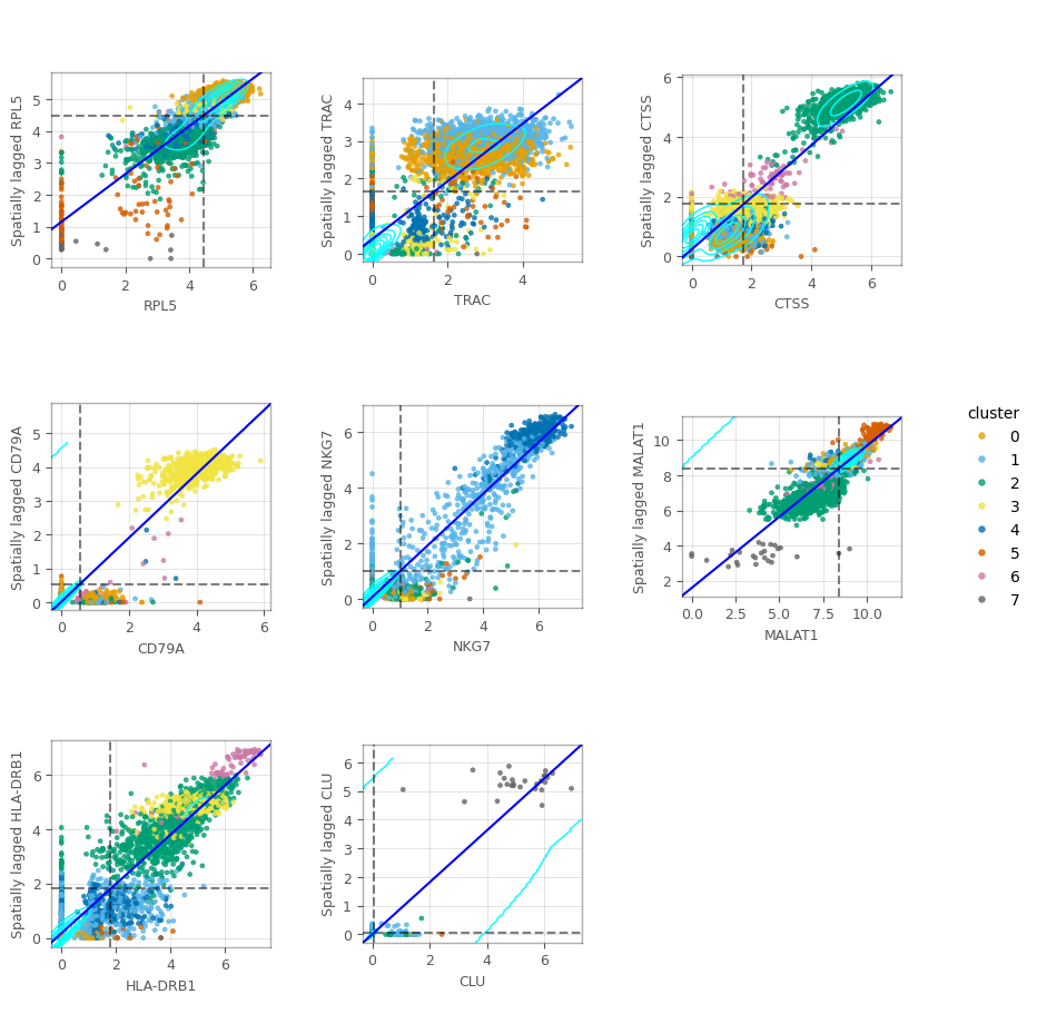
In the figure above, we can see some clusters. In some of these plots, we can also see columns around the 0-expression, meaning that these cells don’t express the corresponding gene despite their neighbors do.
In this notebook, we have applied univariate spatial statistics to the k nearest neighbor graph in PCA space of the gene expression, rather than the histological space. Just like in histological space, it would be impractical to examine all these statistics gene by gene. Thus, multivariate analyses incorporating the KNN graph may be interesting.